Customer Success Stories
Check out these examples of the work Penkai has done for our clients! Learn about what troubles we faced for each client and how we overcame them in order to provide the perfect custom box to fit their needs!
Drunk Elephant
Objective
- Create a simple and unique skincare brand packaging box that will impress customers
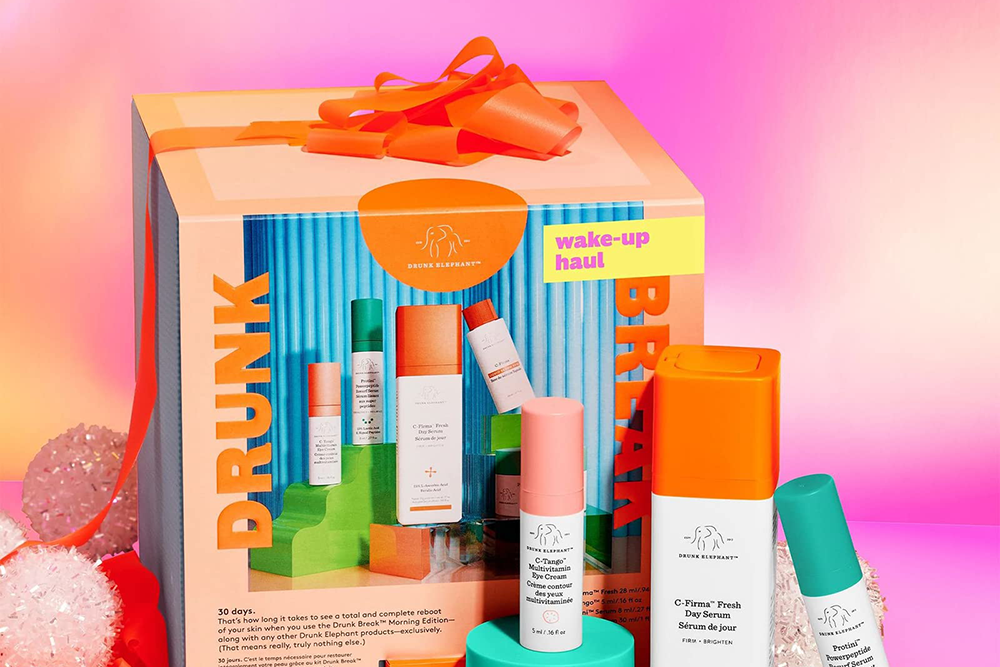
- Create a unique look and the brand’s logo, a cute elephant, is subtly integrated and enhances the brand image.
What We Did ?
- The packaging color palette is often bright and bold, adding a touch of playfulness. The labels are simple yet informative, clearly stating product details.
- The box has finish and is printed with product details and ingredient list in a clean font. This custom packaging helped Drunk Elephant stand out in the crowded skincare market.
- Delivered 5,000 units of the order to the customer within a week.
Glossier
Objective
- Create a simple and unique skincare brand packaging box that will impress customers
- Create a unique look and the brand’s logo, a cute elephant, is subtly integrated and enhances the brand image.
What We Did ?
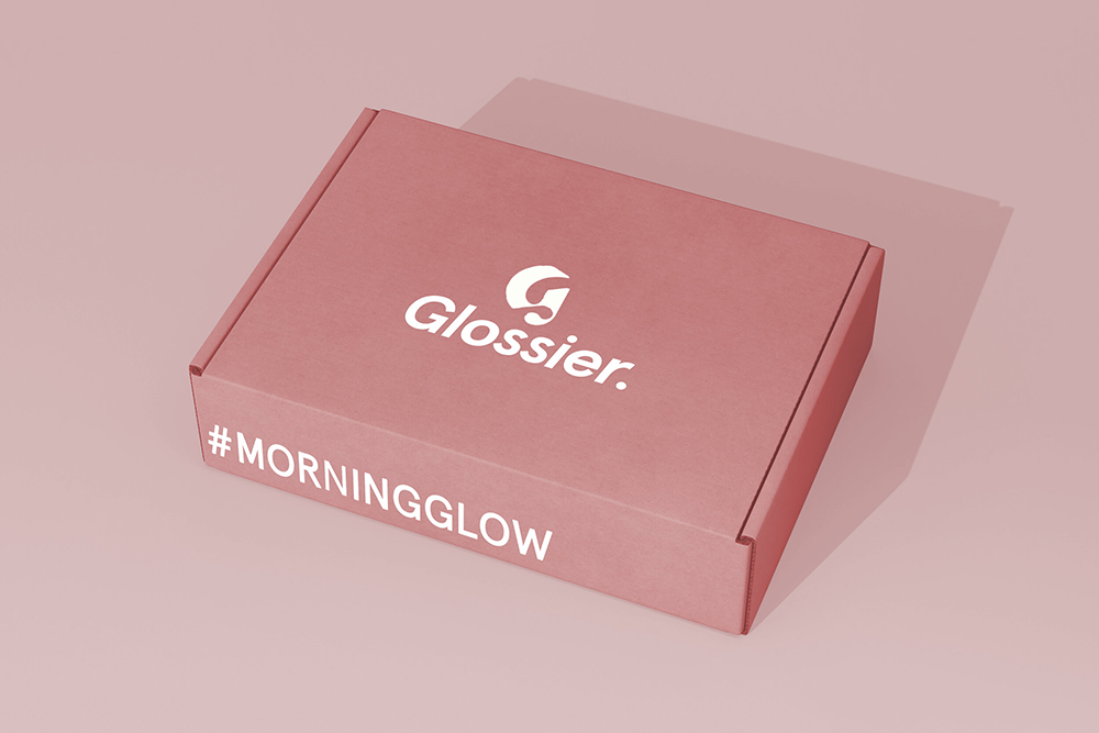
- The packaging color palette is often bright and bold, adding a touch of playfulness. The labels are simple yet informative, clearly stating product details.
- The box has finish and is printed with product details and ingredient list in a clean font. This custom packaging helped Drunk Elephant stand out in the crowded skincare market.
- Delivered 5,000 units of the order to the customer within a week.
Covet Chocolate
Objective
- To create a sophisticated and minimalist style, the use of colored pencils reflects the company’s commitment to using organic ingredients derived from nature, leaving a lasting impression on customers.
- Through the unique packaging design, Covet distinguishes the brand from other chocolate brands, attracts consumers, and enhances interaction with and identification with the brand.
What We Did ?
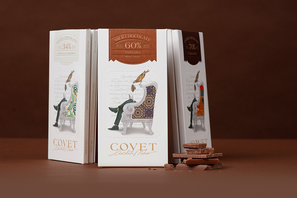
- Customers can personalize the illustrations using 18 unique pattern stickers provided in each package, and part of the package can also be torn off and reused as a coaster or bookmark. This unique design creates a more sustainable and reduced consumable packaging method.
- The illustration on the cover of the package depicts chocolate making as an art genre, and the packaging cleverly combines an illustration of a bird feeding on organically grown cocoa beans, and introduces the animal element together with a poem in the form of a poem, engraved on the background to trigger consumers’ thinking.
Cooper’s Coffee
Objective
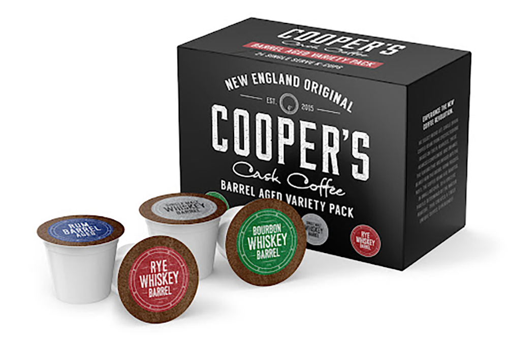
- Create a box that is durable, on-brand, and that would get Cooper’s customers excited about what was inside.
- Develop a classic look and keep with their brand identity.
What We Did ?
- Used Cooper’s classic black and white colors with the logo right across the top of the box so that customers knew exactly what was coming.
- Created a strong box with folded inserts to combine clean lines with convenience.
- Delivered the order of 3,000 units to the customer within a week.
Urban Stems
Objective
- Create a box that is durable, on-brand, and that would get Cooper’s customers excited about what was inside.
- Develop a classic look and keep with their brand identity.
What We Did ?
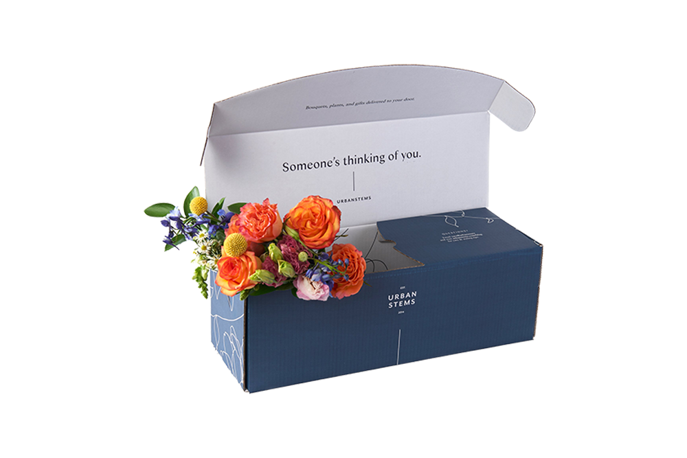
- Created a sleek blue box with a pinwheel design on the side to give a natural, romantic feel that looked genuine instead of cheesy.
- Made sure the box was durable without being too heavy, easy to open, and that protected the flowers.
- Designed multiple shaped and sized boxes to make the perfect fit for their several different types of bouquets.
Six Month Smiles
Objective
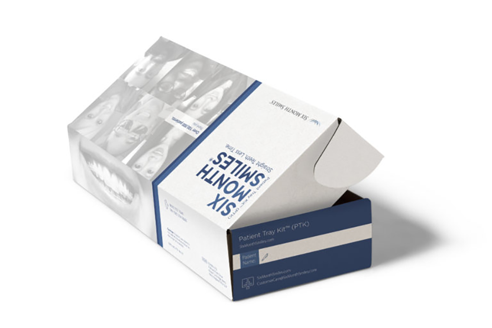
- Give the boxes a sleek, professional look to match the high-end results the company offers.
- Create a box that will excite customers as well as be as great marketing piece for the brand.
What We Did ?
- Used offset printing on the boxes to meet the needs of a clean, crisp look the company was hoping for.
- Used white on the interior of the boxes to symbolize the white teeth and get the patients and the dentists excited about the results. On the exterior, we included Six Month Smiles’ social account handles so happy customers could connect and easily share their results.
- Created an easy-to-open box with clearly labeled custom inserts to hold their product.
Datebox
Objective
- Create a box that won’t give away any secrets about what is inside.
- Ensure the boxes look festive, elegant and most of all, fun for the customers.
What We Did ?
- Created a box with a light teal shade with a pattern of interlocked spirals and swirls with the lettering written in simple, clean white block lettering to give an elegant and fun look.
- Developed a holiday box with white and gold coloring to get customers in the holiday spirit.

Room Dividers Now
Objective
- Create packaging that would match the integrity, quality, and attention to customer service of their company and products.
- Develop of a variety of box sizes and styles to fit the variety of shapes and sizes they offer.
What We Did ?
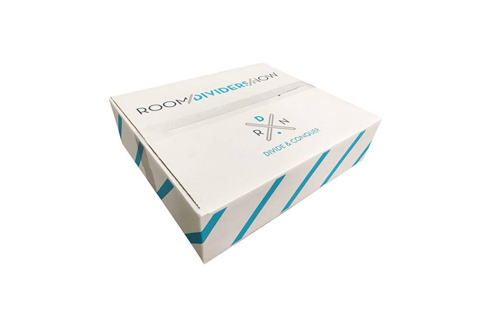
- Created five different box styles and sizes for the company.
- Used a crisp white box with bright blue and gray colors as a design to give the packaging a high-end look and allow the build of brand recognition.
