In the world of graphic design, printing, and packaging, color is a powerful tool that can make or break a product’s visual appeal. Three color systems, namely CMYK, RGB, and Pantone Matching System (PMS), play crucial roles in achieving the desired color output. Understanding the differences between them, as well as when and how to use each, is essential for any designer, marketer, or business owner involved in the creation and production of printed materials, especially in the context of packaging design.
What is RGB?
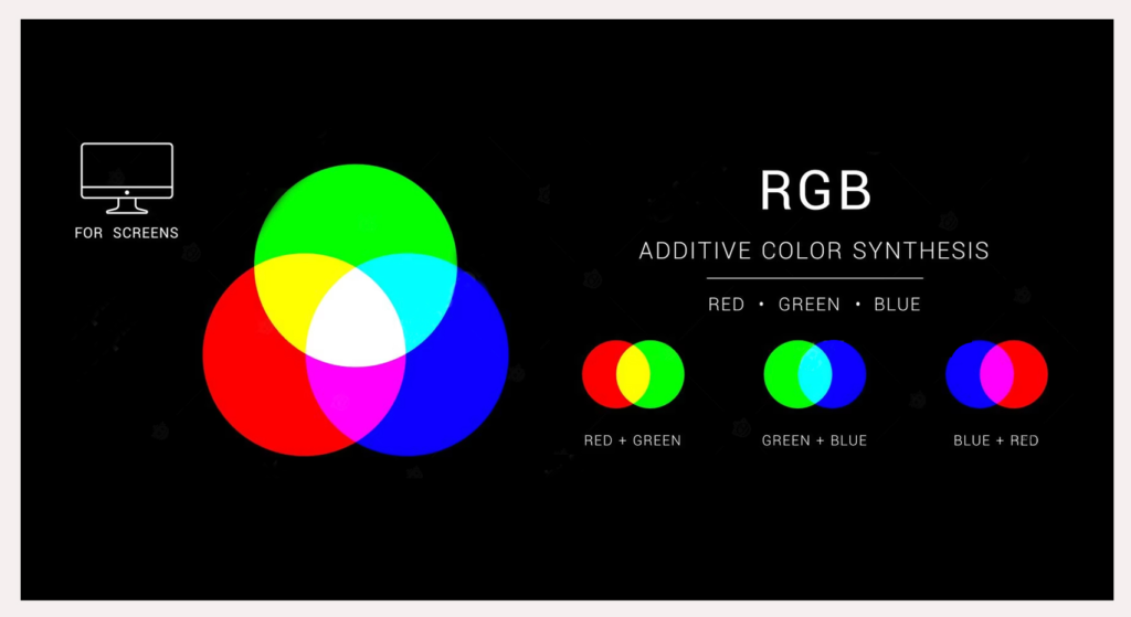
RGB stands for Red, Green, and Blue. It is an additive color model used primarily for digital displays such as computer monitors, televisions, and mobile screens. In this system, colors are created by combining different intensities of red, green, and blue light. The absence of all three colors results in black (since no light is emitted), and the presence of all three at maximum intensity produces white.

The RGB color model is based on the way our eyes perceive light. It offers a vast gamut of colors, capable of displaying millions of hues with great precision. This makes it ideal for digital design work, where the goal is to create vibrant and detailed visuals that will be viewed on screen. For example, web designers rely heavily on RGB to ensure that the colors of a website look accurate and appealing to users across different devices and screen resolutions.
However, RGB has its limitations when it comes to printed materials. Since printers use a different method of color reproduction (subtractive rather than additive), colors that look great on a screen may not translate accurately when printed. This is because printers use pigments and inks that absorb light rather than emit it, and the RGB color space is not directly compatible with the color capabilities of most printers.
What is CMYK?
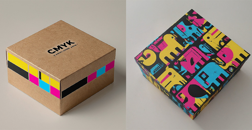
CMYK, on the other hand, stands for Cyan, Magenta, Yellow, and Key (black). It is a subtractive color model used in the printing industry. The idea behind CMYK is that when these four colors of ink are combined in different proportions and printed on a white substrate (such as paper), they can create a wide range of colors. Cyan, magenta, and yellow are the primary colors in the CMYK model, and black is added to enhance contrast, improve color accuracy, and reduce the amount of ink required for darker colors.

Unlike RGB, which is device-dependent and can vary in appearance from one screen to another, CMYK is standardized for the printing process. When a designer creates a file in CMYK, they are essentially specifying the amounts of each ink color that the printer should use to reproduce the desired colors. However, the CMYK color gamut is smaller than that of RGB, which means that some colors that can be displayed on a screen may not be achievable in print using CMYK alone.
In packaging design, CMYK is the most commonly used color model. It allows for the creation of full-color images, gradients, and text that can be printed on a variety of packaging materials such as cardboard, paper, and plastic. For example, a food packaging design might use CMYK to print a photo of the product, along with detailed product information and branding elements.
What is PMS?
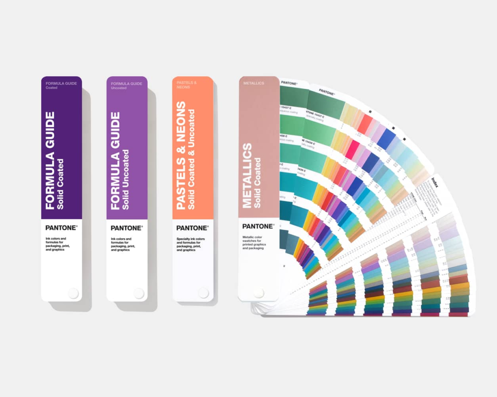
The Pantone Matching System (PMS) is a standardized color reproduction system used in the printing and graphic design industries. Pantone colors are identified by unique numbers and are based on a set of pre-mixed inks. Unlike CMYK, which creates colors by mixing four process inks, Pantone uses a single, specific ink formula for each color.

PMS is widely used when color accuracy and consistency are of utmost importance. It is especially popular in branding and packaging design for companies that have a specific corporate color or a set of signature colors. For instance, a well-known luxury brand might specify a particular Pantone color for its logo and packaging to ensure that it looks the same across all printed materials, regardless of the printer or printing process used.
Pantone offers a vast library of colors, including metallics and fluorescents, which cannot be accurately reproduced using CMYK alone. This makes it a valuable tool for creating eye-catching and unique packaging designs. For example, a cosmetics brand might use a Pantone metallic color for its product packaging to give it a high-end, luxurious look.
Difference between CMYK, RGB & PMS
The main differences between these three color systems lie in their color models, applications, and color gamuts.
RGB is an additive color model used for digital displays, while CMYK is a subtractive color model used for printing. PMS is a standardized color matching system that uses pre-mixed inks for precise color reproduction.
In terms of color gamut, RGB can display a wider range of colors compared to CMYK. However, CMYK is better suited for printing, as it takes into account the limitations of ink on paper. PMS offers the most accurate and consistent color reproduction, especially for specific, branded colors, but it is more expensive and less flexible than CMYK for full-color images.
Another difference is in their use cases. RGB is used for creating digital designs, such as websites, mobile apps, and digital advertisements. CMYK is used for most printed materials, including packaging, brochures, and magazines. PMS is typically used for branding and packaging where color consistency and accuracy are crucial, such as corporate logos, product labels, and luxury packaging.
Process color vs. Spot color
CMYK is an example of a process color system, where colors are created by combining four primary inks (cyan, magenta, yellow, and black) in different proportions. Process colors are suitable for reproducing full-color images and gradients, as they can create a wide range of colors by varying the amounts of each ink.
Spot colors, on the other hand, are single, pre-mixed inks like those used in the Pantone Matching System. Spot colors are used when a specific, accurate color is required, such as a company’s logo color or a unique color that cannot be achieved using CMYK. They are often used in combination with process colors in packaging design. For example, a packaging design might use CMYK for the background image and a Pantone spot color for the logo to ensure that the logo stands out and is reproduced accurately.
When should you use CMYK vs. Pantone
The choice between CMYK and Pantone depends on several factors.
If you are creating a design that requires a wide range of colors, such as a full-color photograph or a complex illustration, CMYK is usually the best option. It is more cost-effective for large areas of color and can reproduce a good approximation of most colors.
However, if you have a specific brand color or a color that needs to be reproduced exactly the same every time, Pantone is the way to go. This is especially important for branding and packaging where consistency is key. For example, if a company has a signature color that is an essential part of its brand identity, using a Pantone color ensures that the color will look the same whether it is printed on a business card, a product label, or a large packaging box.
In some cases, a combination of CMYK and Pantone can be used. For example, a packaging design might use CMYK for the majority of the design elements, such as the background and product images, and a Pantone spot color for the logo or other key branding elements to make them stand out and ensure color accuracy.
How do you make use of CMYK in packaging design?
When using CMYK in packaging design, there are several best practices to follow.
First, it is important to understand the limitations of the CMYK color gamut. Some colors that look great on a digital screen may not be printable using CMYK. Designers should be aware of this and choose colors that are within the CMYK gamut or use color conversion tools to find the closest CMYK equivalents.
Second, proper color management is crucial. This includes calibrating your monitor to display colors as accurately as possible and using color profiles that are compatible with the printing process. Different printers and printing materials may have slightly different color characteristics, so it is important to work with your printer to ensure that the final printed colors match your expectations.
In addition, designers should consider the impact of CMYK colors on the overall packaging design. For example, using a limited color palette can create a more cohesive and impactful design. They can also use CMYK to create special effects such as duotones (using two CMYK colors to create a unique color combination) or color gradients to add depth and visual interest to the packaging.
Finally, when preparing files for printing, make sure to follow the printer’s specifications for CMYK color settings, resolution, and file format. This will help ensure a smooth printing process and accurate color reproduction.

In conclusion, understanding the differences between CMYK, RGB, and PMS, as well as the concepts of process color and spot color, is essential for creating effective and visually appealing packaging designs. By choosing the right color system and using it correctly, designers and businesses can ensure that their packaging stands out on the shelves and accurately represents their brand identity. Whether it’s the vibrant colors of a digital advertisement, the full-color images on a product package, or the precise color of a corporate logo, the proper use of these color systems can make all the difference in the success of a design project.
Start your Packaging Journey Today
Explore our range of custom boxes & printed packaging solutions.

